
If you’ve read some of my other posts, you may already know the backstory to our purchase of No. 139 Maplewood Ave.
When we finally moved all our living room furniture in, furniture that was specifically chosen for the smaller center hall colonial we just left. It just didn’t work. I mean, sure, there were pieces that I could reuse, but now we found ourselves with a grand Victorian Parlor! With it’s soaring ten foot ceilings and 12’X29’ dimensions, this parlor looks more like that in a NYC Brownstone, then a suburban house.
I found my starting point and something to Google – the Victorian Brownstone. Having always been a fan of the eccentric Victorian age, I knew something about this genre and had no interest in faithfully recreating a period Victorian parlor as it was often cluttered with heavy furniture and ornate fabrics. Yet, I wanted to find a way to incorporate key Victorian features melded with modern elements and my own eclectic tastes.
I distilled my solution into four distinct strategies:
- Create a visually stunning room with many small details so that visitors would notice something new every time they entered the room.
- Create multiple seating areas to fill the space while at the same time allowing for movement, comfort, and conversation.
- Incorporate subtle gothic and steampunk décor as well as modern pieces.
- Create detailed patterns in specific areas rather than everywhere.
At first, I got it into my head that I wanted flat white walls and high-gloss white trim. I latched onto a primary color scheme and became obsessed with Kelly green club chairs. I searched far and wide and couldn’t find them. If I couldn’t have them, I would have to find a new color inspiration.

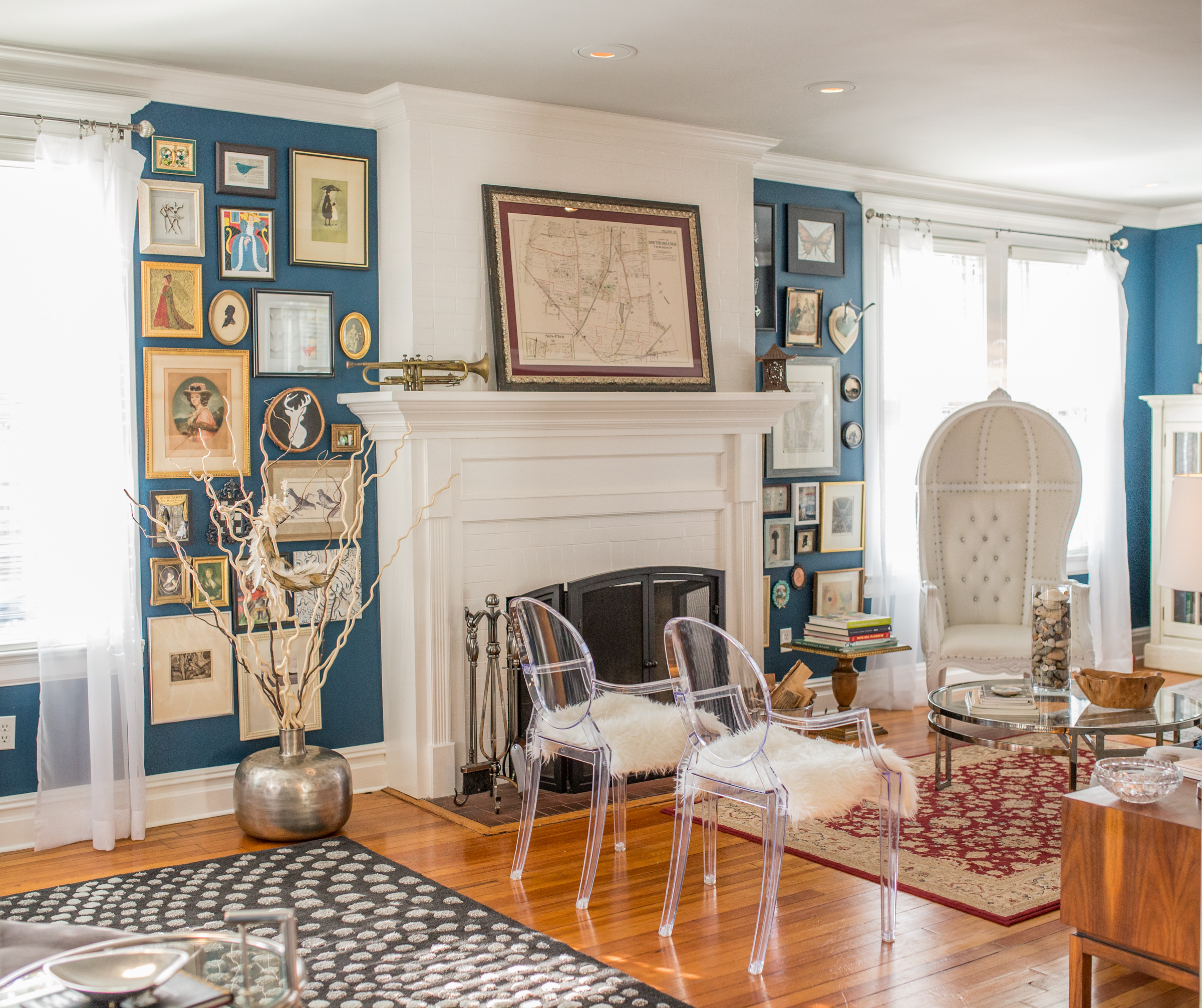
I searched Benjamin Moore’s “Rooms by Color” section – their color experts take the guess work out of pairing. I fell in love with a color, teal. And while I agreed with the grey ceiling color, I really wanted to paint the trim high-gloss white, creating a modern color pop. White blinds and curtain sheers widow treatments complimented the scheme. The end result, combining rich teal, bright white, and muted grey complemented the color scheme for my refurbished dining room
Riffing on white, I reused a pair of off-white 1920’s bookcases with glass doors that had previously been in our family room. Above each, I placed white antique tin ceiling panels from Olde Good Things. I reupholstered our Room & Board couch in a light grey cotton velvet, a fabric popular with the Victorians. A pair of mid-century modern end tables with brass button knobs from Amy Hugh’s shop, Salvage Style, flanked it. Two acrylic Louis XIV Ghost Arm Chairs from Amazon with folded faux sheep skin rugs from Ikea on the seats provided movable seating. But the show stopper is a Victorian-style white leather and wood canopy chair, also known as a dome or balloon chair.
Our mid-century modern chaise in dark grey cotton velvet from Room & Board fit right in – the Victorian’s loved this versatile piece of furniture. Likewise, my Aunt Celia’s mid-century modern settee from 1963 was reupholstered in a modern botanical fabric with teal, grey, and maroon. The Victorians loved bringing nature indoors. And I found my accent color – maroon.
Three area rugs with intricate modern and traditional patterns each created a distinct area: the dry bar and lounge, the fireplace with intimate seating for six, and a lovely window seat nook. The rug sizes offer more than a glimpse of the beautiful original 1894 hardwood floors beneath. Each section is outfitted with lamps – each a different style, but all sporting chrome, crystal, and/or lucite.
Perhaps the most important (and popular) creative features of the room are the two gallery walls on either side of the fireplace. I broke all the rules on this one – I didn’t experiment with patterns like the experts recommend. Rather then wait to have a complete art collection before placing them on the wall, I hung each as I got it. I hung the first piece of art halfway between the top and bottom and just radiated out from there. These walls are show-stopping and spur many conversations. Maybe it’s because I didn’t over think it – and that’s the most important lesson to come out of this exercise!